
Course Work
Pain Cards
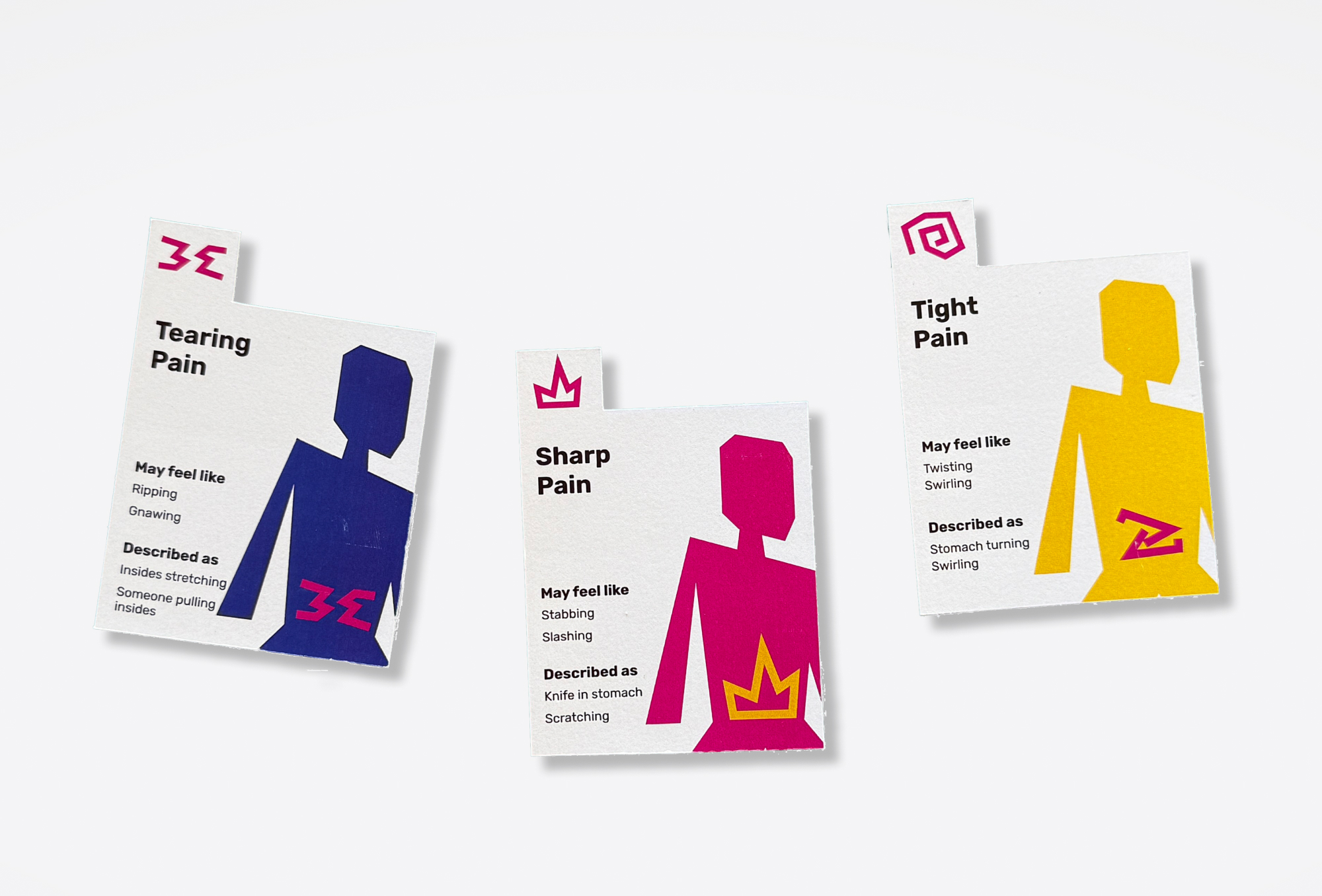
A card-based tool that helps patients communicate abdominal pain more clearly in time-limited GP appointments.
Role
User Designer
Researcher
Graphic Designer
Responsabilities
Led the focus group, usability testing and research design. Synthesised insights into personas and journey maps. Led low-fi and hi-fi prototyping. Conducted 3 interviews.
Tools
Figma
Adobe Illustrator
Adobe InDesign
Google Forms
Methods
Interviews · Survey · Focus group · Personas · User journey · Usability testing · Affinity mapping
Overview
GPs have only a few minutes with each patient, and many people struggle to put pain into words. This project explored why patients turn to self-diagnosis, and resulted in a set of physical pain cards that help patients describe abdominal pain more precisely during the appointment itself, improving diagnostic accuracy and patient-doctor trust.
The Problem
Interviews with 9 patients and 8 healthcare professionals showed patients often arrive either over-prepared (contesting the diagnosis with online research) or under-prepared (unsure what to say). Short appointment times made both worse, weakening trust on both sides. We narrowed our focus to self-diagnosis: how patients interpret health information before and during a visit.
Key Insight
Secondary research pointed to communication quality and time spent together as the biggest levers for trust. Journey mapping confirmed most trust breakdowns happened during the appointment, not before it, reframing self-diagnosis as a symptom of patients not feeling heard, rather than a standalone problem.
Two early concepts (a pre-appointment reflection tool, and a digital AI-paired symptom visualizer) were tested and dropped: both felt impersonal or added a layer between patient and doctor rather than improving the conversation itself. A survey of 47 people who'd struggled to describe pain showed abdominal pain was the most common issue, and that no one had ever used a visual method to communicate pain to a doctor, despite readily using one in a workshop setting. This pointed to a clear gap: a low-tech, visual tool used in the room.

Design
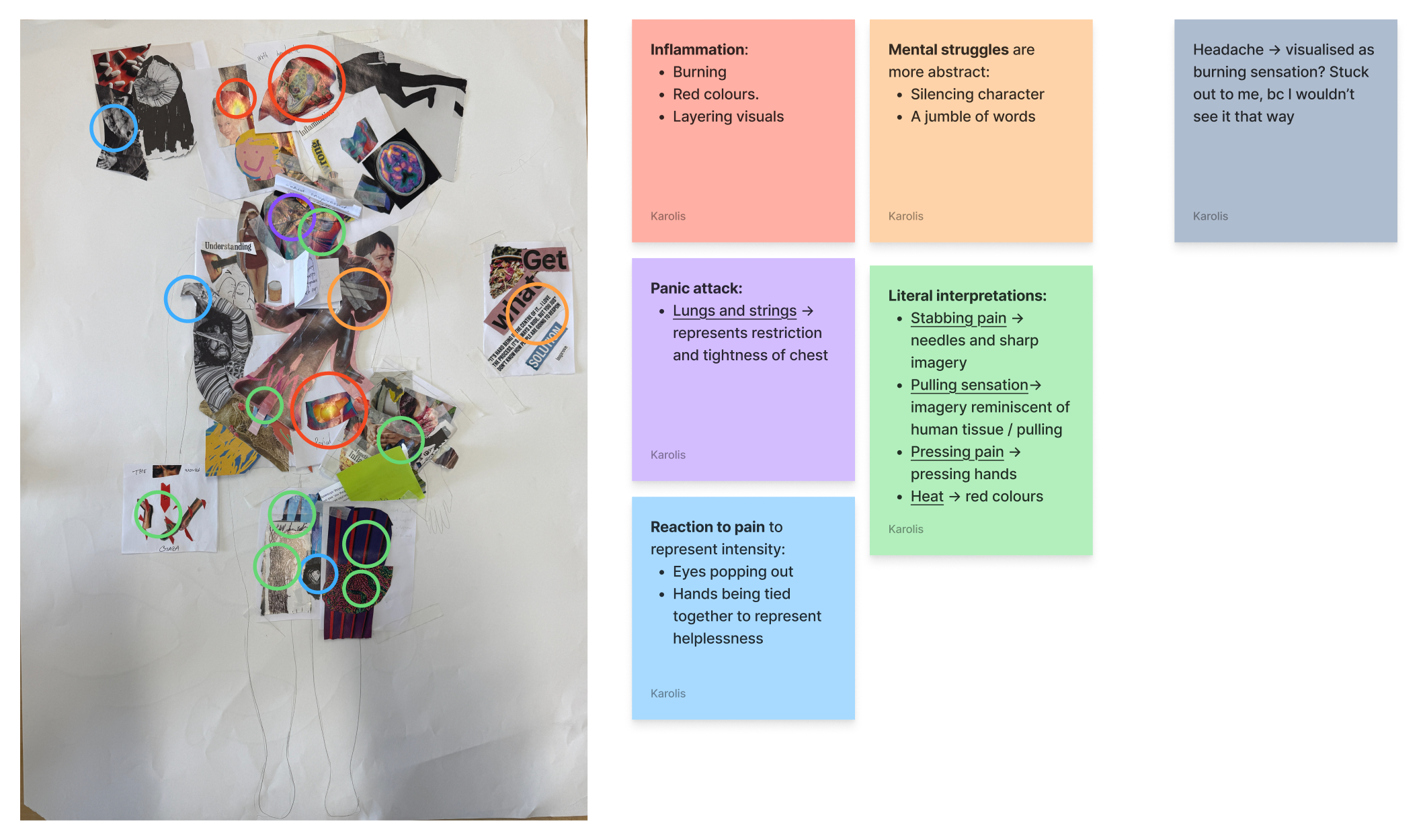
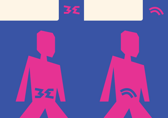
The result was a set of physical cards, one per pain type (e.g. sharp, burning, referred), loosely grounded in clinical pain categories. Each card shows an icon and descriptive words on the front and just the icon on the back, so patients can select cards by sight. Color and iconography were tested for color-blind accessibility, with plans for tactile and Braille elements in future iterations.


Testing
A usability test with 6 participants simulating a GP visit showed patients could accurately select and categorize pain cards, even without seeing the icons in advance. Feedback from two practicing anaesthesiologists validated the core idea, noting that pain is highly subjective and often dismissed, and that a shared visual vocabulary could reduce that dismissal and help patients facing language barriers


Outcome
A tested, low-tech card set that gives patients and doctors a shared language for describing abdominal pain, backed by research on trust and communication in healthcare. Next steps include refined iconography, tactile elements, and modular cards for overlapping symptoms.